Dan Collison

LinkedIn

Case study

Guru Systems

  • B2B
  • SAAS
  • Tech startup
  • Energy sector
  • Retention
  • Data analytics
  • Data vis
  • Design system
  • Information architecture
  • UX / UI design

Caption competition now open.

Project overview

Team

  • Product designer (me)

Timeline

  • November 2022 - May 2023
  • 6 months

Impact

The improved design allowed the business to win and retain customers.

What I did

  • Project strategy
  • Workshop facilitation
  • Made new design language..
  • .. and a design system
  • Conducted interviews
  • Re-designed the IA & UI

The best case scenario!

This project was really enjoyable.

I was asked to 'redesign the SaaS platform' - a big responsibility.

I was trusted to work independently while being open to input.

I had six months to deliver, so I planned and used my time accordingly.

The responsibility matched well with my skills and experience.

About Guru Systems

Guru Systems is a B2B SaaS tech startup in the heat networks and low emissions energy space.

They specialise in performance analytics and remote heating control.

Their customers are property developers setting up sites with energy meters and heating devices and housing associations maintaining heating hardware and calculating energy bills.

They produce their own hardware as well as software.

Pre-project

Briefing & strategy

Onboarding

I was brought in by the CPO and asked to redesign the SaaS platform.


The problems to solve were

The navigation and IA was disorganised

The UI functionality hard to understand

The brand identity was not confidently expressed

Interfaces were inconsistent without a design system


I planned for two projects

A design language / design system

An IA / UI audit and redesign

I came up with two project plans

A design language / design system

An IA / UI audit and redesign

Project one

Design language / design system

UI and brand audit

I audited the SaaS platform's UI - as well as the brand guidelines and primary marketing assets.

This gave me an overview of the styles, components, and page templates used across the platform - as well as an insight into how the brand image was being expressed in materials outside of the main software.

I cropped out screenshots of each component and made decisions around which should be redesigned, consolidated, or discarded.

Legacy product components Guru Systems brand logo

Asset

Takeaway

SaaS UI

Components that serve similar functions could be consolidated down to single components.

Several components required multiple size variants to suit various types of content.

Brand guidelines

The UI colour ratio should reflect that found in the primary brand logo.

Best practice research

I had worked with design systems before - but this was my first time building one from scratch.

As part of the project - I conducted some best practice research - by analysing the biggest and best digital brands and their design systems.

Gov UK design system annotations Atlassian design system annotations

Design principles workshop

The creation of a new design language for a flagship product must be handled carefully.

Stakeholders may wish to have a say, it's possible that not everyone will agree, and there is a risk that quality will be compromised.

The best way to cure post-design pushback and conflicting feedback is to prevent the entire thing from happening, pre-design.

I ran a workshop to allow each stakeholder to publicly express their design-based preferences.

They did this by sharing screenshots of their favourite products and talking about the styles and features that made them so enjoyable to use.

We grouped the preferences in an affinity mapping session to find unifying themes or 'design principles'.

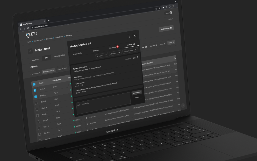
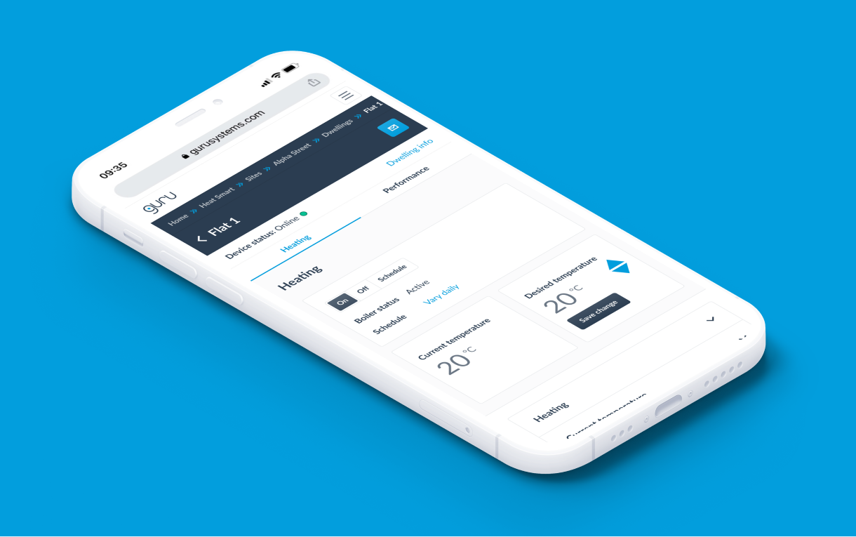
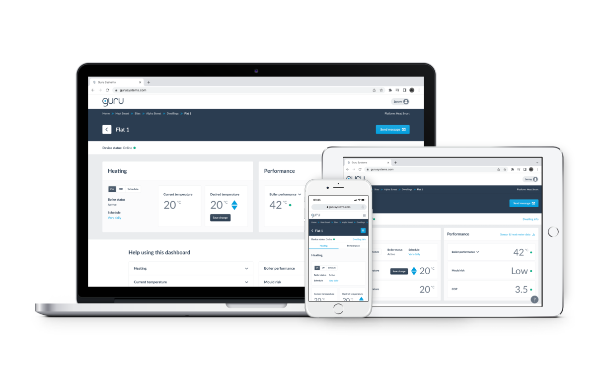
I assured the stakeholders that the principles would be referred to and implemented in the creation of the new design language.

The session achieved a state whereby every stakeholder was able to see that their design-based values were understood and acknowledged.

Workshop Miro board

Principles

Clean look and feel

Make complex data easy to digest

Allow simple manipulation of complex data

Empower users to control their own workflow

Simple IA / navigation

Design language

I created a brand new design language.

I factored in the top UI related design principle: Clean look and feel

I adhered to the colour ratio as per the brand guidelines

I documented the design decisions

Desktop data table UI - light mode Desktop data table UI - dark mode Mobile data table UI - light mode Mobile data table UI - dark mode

I came up with a light mode and a dark mode. The senior leadership signed off on the former.

Design system

I made the design system in Figma.

It contained three primary elements.

Styles

Components

Documentation

Design system colours Figma component with variant options

I did this alongside the IA / UI redesign, so I was adding components as I went.

I published the system to the company Figma account so it could be used on projects going forward.

The final product contained around twenty pages.

I estimate my Figma skills to have progressed from intermediate to advanced during this process.

Read more about the design system in this LinkedIn post

Project two

IA / UI redesign

IA / UX audit and interviews

I took a screenshot of every interface on the site.

I put the screenshots in a Miro board and tied them together with lines to create a wireflow.

I annotated each screen, noting neutral observations, usability concerns, questions to ask, and ideas for improvement.

I interviewed the PMs to broaden my understanding around the users, use cases, problems to solve, and ideas for solutions and new features.

Area

Takeaway

IA

A simplified and easier to navigate site structure was possible.

Data tables could be paired with dashboards to present the user with high-level info.

UI

The breadcrumb trail would need to be rebuilt to accurately reflect the page hierarchy.

The data table UIs would be easier to use if they featured search and filters.

The heating control dashboard UI could be restructured for easier use.

Content

Unnecessary jargon could be replaced with simple language.

'How-to' content could be provided to help novice users understand technical subject matter.

This is small subset of key takeaways.

The user research that wasn't

I requested access to users for research - the business declined - for the following reasons.

They had a small user base and did not want to narrowly skew the product in their favour

All users would be trained by client services, so the CS team could provide input

The SaaS platform contained five services.

Service

Main function

User type

Proposed research

Allowed?

Verify

Verify meter installation

One-time

Day on-site / shadowing

Integrate

Configure heating hardware

One-time

Remote interviews

HeatSmart

Monitor and control heating

Regular

Day on-site / shadowing

Pinpoint

Identify network problems

Regular

Remote interviews

Pay

Bills and payment

Regular

Out of scope

-

Verify

Main function

Verify meter installation

User type

One-time

Proposed research

Day on-site / shadowing

Allowed?

Integrate

Main function

Configure heating hardware

User type

One-time

Proposed research

Remote interviews

Allowed?

HeatSmart

Main function

Monitor and control heating

User type

Regular

Proposed research

Day on-site / shadowing

Allowed?

Pinpoint

Main function

Identify network problems

User type

Regular

Proposed research

Remote interviews

Allowed?

Pay

Main function

Bills and payment

User type

Regular

Proposed research

Out of scope

Allowed?

-

The user research that was

The 'Integrate' service was brand new and I was able to design it with external user input.

I consulted with a subject matter expert who had previously been in a heating engineering role similar to that of the target users.

I used the opportunity to learn about users, their roles, goals, likely pain-points, and what functionality and content they would require.

I verified my UX / UI work with the external contact across five rounds of design and feedback.

Research and design board

Information architecture

I took all of my learnings from the previous stages and applied them to the following.

A sitemap with a completely restructured site architecture

A navigational Figma prototype to demonstrate the new information architecture

A list of requirements to inform the redesign of underperforming interfaces

Partial sitemap Figma prototype

The senior leadership approved all three artefacts before I started the final phase of the project.

UI design

I applied the design language and design system to every user interface.

I folded in my learnings from the previous phases to improve the content and functionality.

I validated the designs with a small group of stakeholders and customers.

Service-level dashboard

Service-level dashboard showing key data from a corresponding data table.

Service-level dashboard Service-level dashboard Service-level dashboard Service-level dashboard
Heating device asset table

Heating device table with search, filters, and bulk action functionality.

Heating device asset table Heating device asset table Heating device asset table Heating device asset table
Popup modal with activity log

Multi-tab popup modal with read and write heating device activity log.

Popup modal with activity log Popup modal with activity log Popup modal with activity log Popup modal with activity log
Heating dashboard

Single dwelling heating dashboard with controls and boiler performance stats.

Heating dashboard Heating dashboard Heating dashboard Heating dashboard
Heat network performance data vis

Heat network performance charts, rehoused inside a full-screen popup modal.

Heat network performance data vis Heat network performance data vis Heat network performance data vis Heat network performance data vis

Project retro

What was achieved?

Problems solved

Order restored to the navigation and signposting

An improved UI with a better user experience

A bolder and more on-brand design language

Consistent interface with a design system


Project takeaways

Save time with Figma and take a risk with a workshop.

I learnt a lot about Figma during the project. It's a great tool. I used Auto Layout on the design system components but not on the page templates. At the time I thought this was the best approach - but it isn't. It means more time manually arranging components within pages. So I learned to lock everything down with Auto Layout.

I was on the fence about running the design principles workshop. I want to be mindful of stakeholders' time. The reason to run the workshop was to avoid design-related friction. It is possible that the stakeholders were never going to find fault with the work, but on balance it was worth taking up that time just to be sure.

Next case study

Cazoo logistics dashboard: Service design & product design

  • B2E
  • Internal tools
  • Enterprise
  • Logistics
  • Efficiency

I increased the speed of Cazoo's logistics operations by designing a business-to-employee platform to facilitate its national vehicle import, storage, and export operations.

View case study
Cazoo logistics dashboard